
Operations, service delivery, logistics
Operations command view
Best for teams that need a daily view of workload, exceptions, throughput, and owners.
Dashboard reporting sprints for clearer decisions
We build Power BI dashboards that turn scattered sales, finance, operations, and customer data into live executive reporting. Australian teams can track what matters, spot risks early, and move with confidence.
Service command deck
Power BI Dashboard Development Australia
Insights changing live
Starter range
$400-$1k
Sprint 1: Dashboard / Reporting
This sprint is built for teams stuck in spreadsheet packs, SAP exports, CRM reports, or disconnected dashboards. We define the metrics, clean up the reporting layer, and ship a decision pack leaders can actually use.
Agree the KPI logic, owners, and reporting rhythm before build starts.
Replace dense exports with readable executive and team-level views.
Create a practical cadence for surfacing risks, actions, and next decisions.
Proof + first action
Use the Transit Couriers proof route as the closest dashboard sprint example, then ask for the first messy report pack so the scope starts with live operational pain rather than abstract dashboard wish lists.
Proof route
Show how multiple operational systems can be turned into a practical reporting layer before the buyer commits to a larger data program.
Open dashboard proof →First sprint input
Ask for the current spreadsheet, SAP export, CRM report, or leadership KPI pack so the first dashboard sprint is scoped around a real decision cadence.
Start the reporting pack brief →Dashboard proof
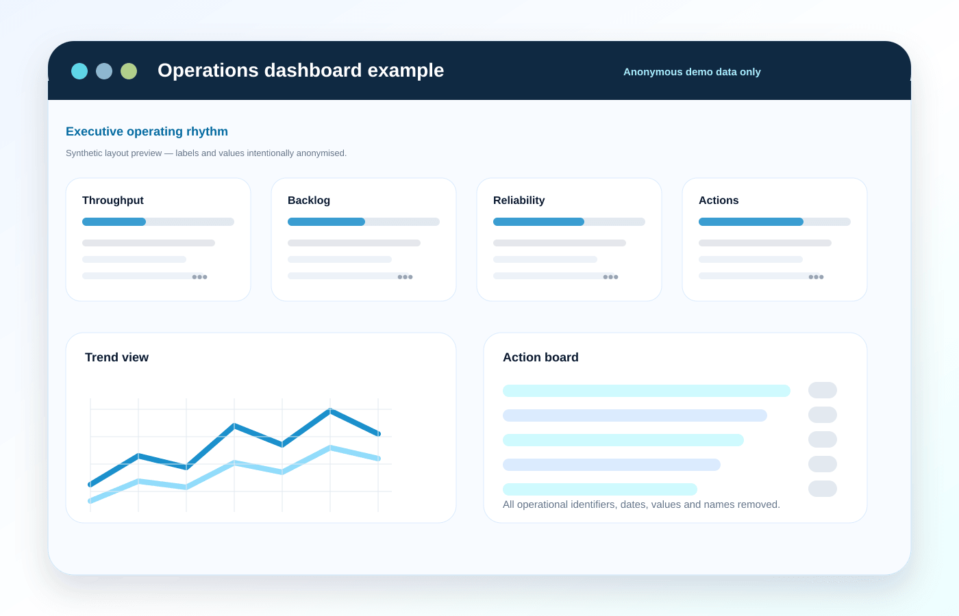
The strongest dashboard example is the Transit Couriers case study: several disconnected operational tools were turned into one readable dashboard and weekly decision layer. It is the cleaner proof path for buyers who need fewer spreadsheet exports, clearer operational visibility, and a practical first reporting sprint.
The preview image is public-safe and sanitised, while still showing the kind of layout, KPI hierarchy, and action visibility a Dashboard / Reporting Sprint can create.
Read the Transit Couriers dashboard case study →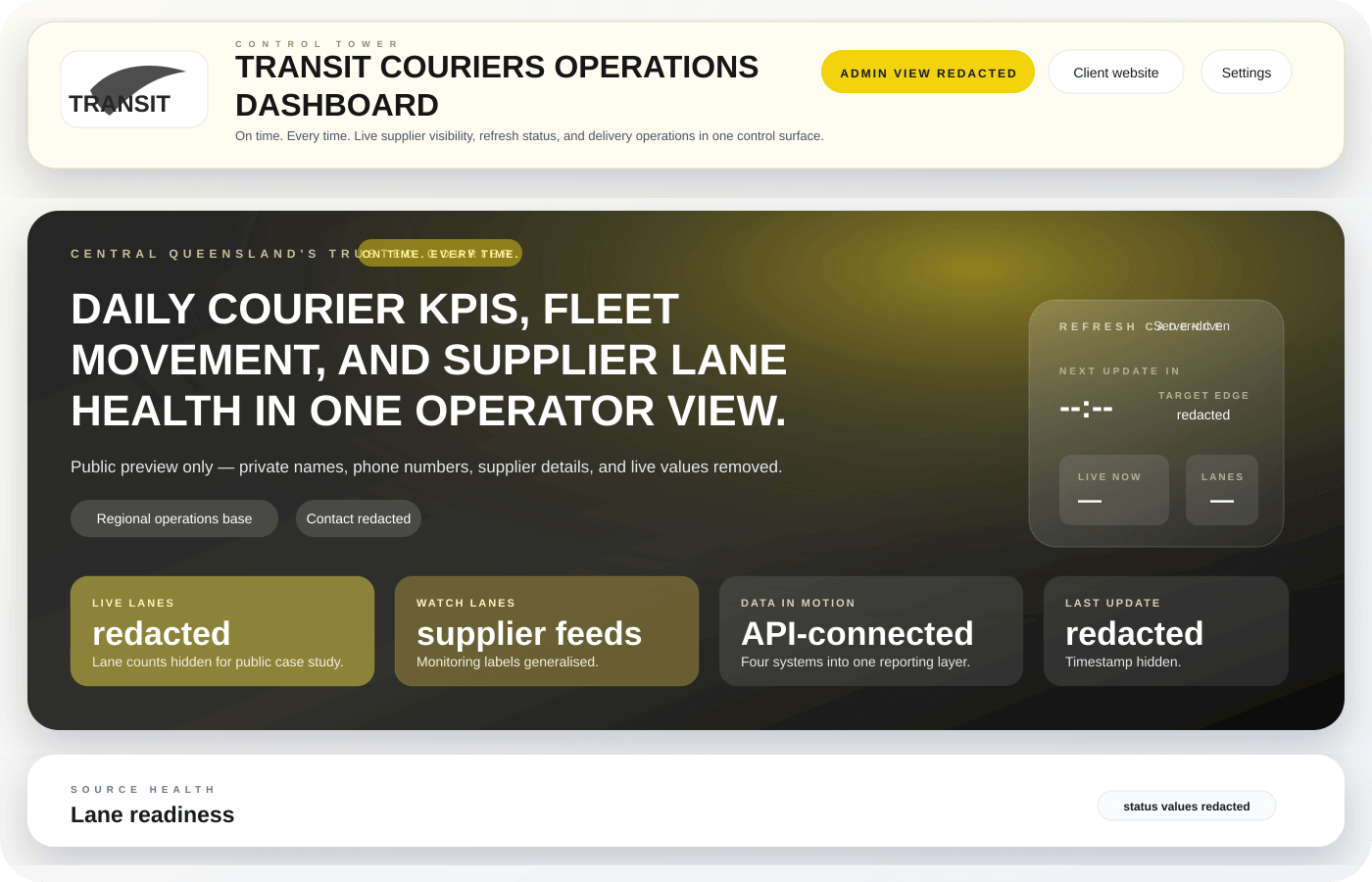
Public-safe dashboard example gallery
These are sanitised example layouts, not live client data. Use them to identify the reporting shape that best matches your operations, then we scope the first Dashboard / Reporting Sprint around the decisions your team needs to make weekly.
Operations, service delivery, logistics
Best for teams that need a daily view of workload, exceptions, throughput, and owners.
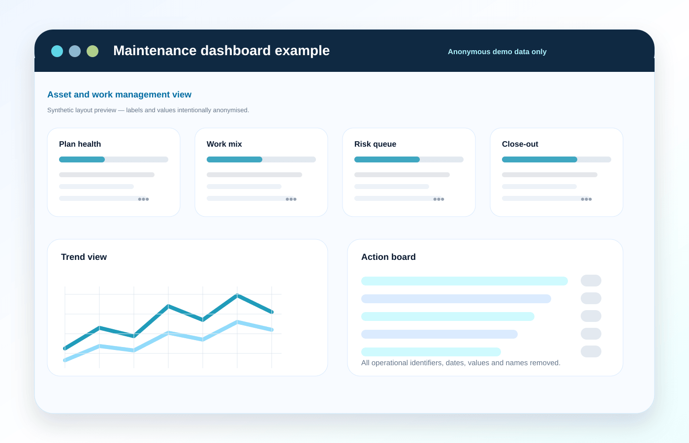
Mining, manufacturing, field service
Best when work orders, asset health, backlog, and safety signals need one trusted rhythm.
Courier, transport, multi-system operations
Closest proof route for replacing disconnected operational exports with a weekly decision layer.
Open the matching proof route →High-impact capabilities aligned to your goals.
Turn the current weekly report into a clearer management rhythm
Connect the practical sources needed for the first useful dashboard
Use public-safe examples to choose the right reporting shape before build
A practical rollout that gets your dashboards live in weeks
We learn your business goals, identify key metrics, and map your data sources
Clean, organize, and connect your data sources for accurate insights
Create intuitive, visually appealing dashboards tailored to your needs
Teach your team to use the dashboards, confirm the launch cadence, and show how report outputs can trigger the next operational workflow.
See the Evolution Happens survey results automation example →Measurable outcomes, clearly defined.
Leadership sees the numbers, exceptions, and actions without chasing spreadsheet owners.
The first sprint cuts report assembly friction and creates a repeatable decision cadence.
KPI logic, assumptions, and source checks are visible before the dashboard becomes business-critical.
Dashboards highlight risk, blockers, backlog, margin pressure, and owner actions instead of decorative charts.
Readable cards, filters, and drill paths help managers use the report without Power BI expertise.
Once the first pack proves useful, deeper refresh automation and integrations can be scoped with confidence.
Scope, outcomes, and pricing
Clear outcomes, practical scope, and pricing you can plan around.
Dashboard / Reporting
Turn spreadsheet exports, CRM reports, and operational data into one readable decision layer.
Weekly decision pack
Leadership gets the current KPI view, exceptions, and next actions without manual report assembly.
Trusted KPI logic
Shared definitions and reconciliation checks keep marketing, finance, and operations aligned.
Reporting efficiency
Automated refreshes replace manual report assembly and spreadsheet churn.
Indicative ranges help planning. Final pricing is based on complexity, integrations, and delivery pace.
Insight Starter
$400-$1k
2-3 weeks
Single-domain dashboard for one department with essential KPI tracking.
Business Core
$1k-$5k
3-6 weeks
Multi-source dashboards with executive + team-level reporting views.
Enterprise Analytics
Custom
6+ weeks
Advanced modelling, forecasting layers, and broader integration footprint.
Data confidence
QA-backed KPI definitions
Logic reviews and reconciliation checks completed before handover.
Adoption support
Training for non-technical teams
Practical onboarding designed for day-to-day business users.
Ongoing value
Iteration roadmap available
Optional expansion path for new metrics and business units.
Closest proof routes
Local dashboard entry points
Related proof and fit
FAQ support
Clear answers on timeline, investment, and delivery scope.
Power BI gives leadership a live view of sales, operations, and margins in one place. Most teams cut manual reporting time and make decisions faster because KPI trends are visible without spreadsheet consolidation.
Yes. We design dashboards for non-technical teams with clear filters, drill-down views, and role-based layouts. We also provide onboarding so managers and staff can use the system confidently from day one.
We regularly connect accounting, CRM, e-commerce, ad platforms, and spreadsheets, including QuickBooks, Xero, HubSpot, Salesforce, Shopify, WooCommerce, and GA4. If your tool exposes usable data, we can usually connect it.
Most projects land between $400-$5k depending on integration depth and reporting complexity. Many teams start with an Insight Starter sprint and expand to Business Core once KPI definitions are proven.
Send the current spreadsheet, SAP export, CRM report, or leadership pack and we will map the smallest useful Dashboard / Reporting Sprint around it.
No commitment required. We will help you pick the right first sprint before any build commitment.